

One of the exercises I’ve run with clients, more times than I can count, goes like this. I name a brand in their category and ask: “If this brand were a person at a dinner party, who would they be?” Almost every time, the answer comes out fast and specific. Basecamp is the friend who doesn’t overcomplicate anything. Monday.com is the friend who turns the dinner into a party. The client knows the answer immediately — which means their customers know it too.
This is a Creative & Design post about something easy to underestimate: brands have personalities, whether they were designed deliberately or not, and customers are pattern-matching on those personalities every time they make a purchase decision.
Let me walk through five pairs I use as calibration exercises. Each pair does roughly the same job in the market. But the personalities — expressed through product design and visual identity — send very different signals.

Basecamp vs. Monday.com – The Minimalist Manager vs. The Dynamic Collaborator
Think of these two as your friends who manage projects very differently. Basecamp is your calm, laid-back friend who cuts through the clutter to get things done efficiently. Their clean, no-frills design reflects this mindset, with soft colors and straightforward functionality. Everything is designed to simplify—no unnecessary bells and whistles.
On the other hand, Monday.com is that friend who loves to add color and energy to everything they touch. Their vibrant, visually stimulating interface is built for collaboration, with customizable boards and dynamic workflows. Monday.com’s bright reds, greens, and yellows scream energy and creativity.
Both help you manage your projects, but the real question is—do you prefer the quiet, zen-like approach of Basecamp or the high-energy collaboration of Monday.com

Mailchimp vs. ConvertKit – The Marketing Generalist vs. The Niche Expert
When it comes to email marketing, Mailchimp and ConvertKit are like two friends with very different approaches to helping you connect with your audience. Mailchimp is the friendly generalist who can do it all—email campaigns, social media ads, audience analytics, you name it. Their quirky yellow and playful chimp mascot invites users into a world of fun, approachable marketing for all.
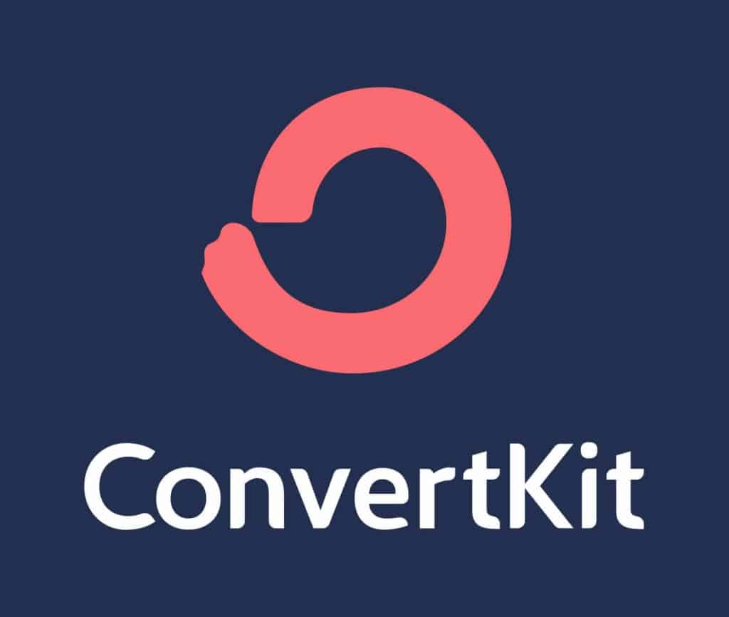
Then there’s ConvertKit, your friend who knows exactly what they’re good at and sticks to it. They focus on serving creators—podcasters, bloggers, and course creators—offering an intuitive, focused approach to building relationships. Their minimalistic, professional design speaks directly to their niche audience, using muted colors and clean lines to say, “Let’s get serious about your audience.”
Both tools will grow your email list, but with Mailchimp, you get a jack-of-all-trades; with ConvertKit, you get a specialist.
Squarespace vs. Webflow – The Designer for All vs. The Developer’s Playground
Building a website is a lot like designing a house—Squarespace and Webflow are the architects with two very different styles.
Squarespace is a polished designer who can whip up a professional-looking website in no time. With its sleek templates, high-quality photography, and modern fonts, Squarespace gives you agency-level design without the hassle. It’s simple, elegant, and designed for anyone.
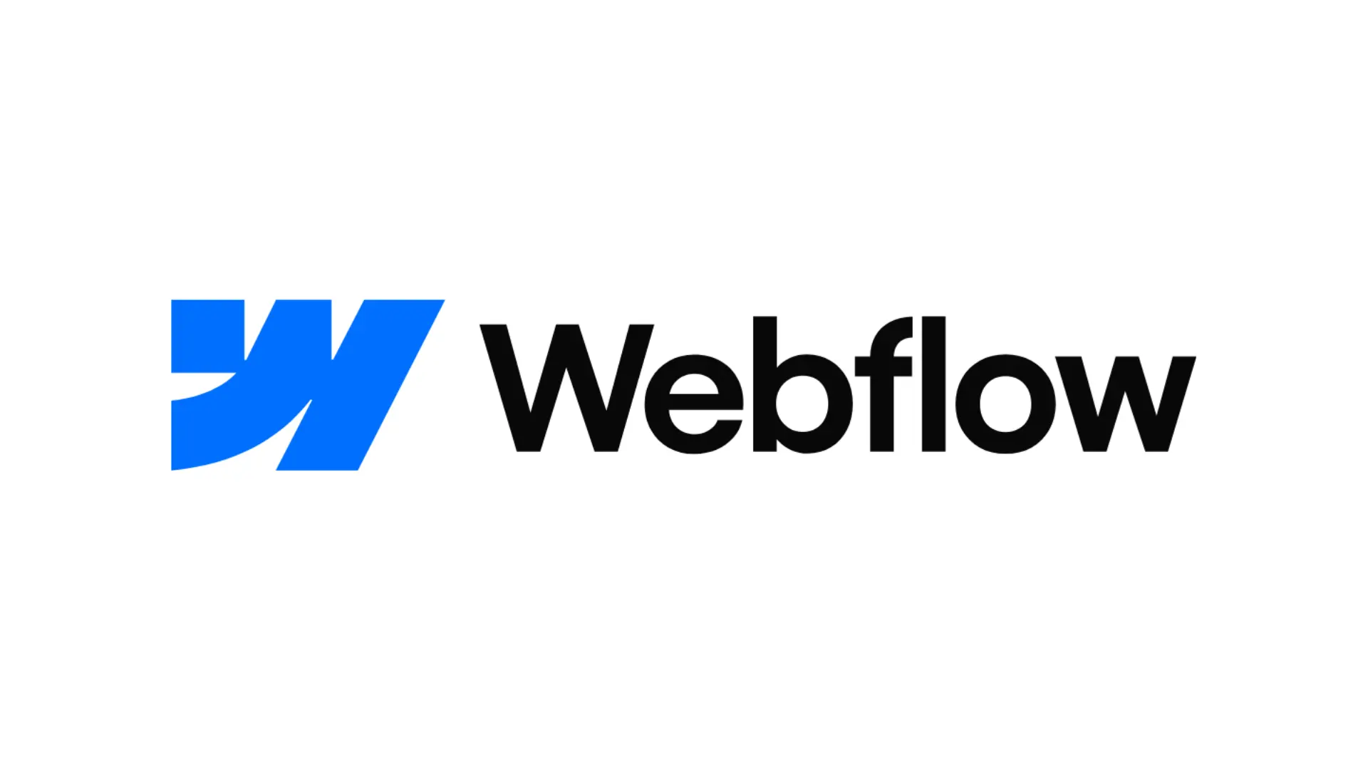
Webflow, on the other hand, is the playground for those who want more. They’re the architect who hands you the blueprints and says, “Go wild.” Their visuals are more technical and customizable, with dark, geometric designs that cater to experienced designers and developers who want full creative control.
Need something that’s plug-and-play? Squarespace has you covered. Want complete freedom and customization? Webflow is your tool.
HubSpot vs. Pipedrive – The All-in-One Marketer vs. The Focused Closer
Regarding managing customer relationships, HubSpot and Pipedrive are two very different types of salespeople.
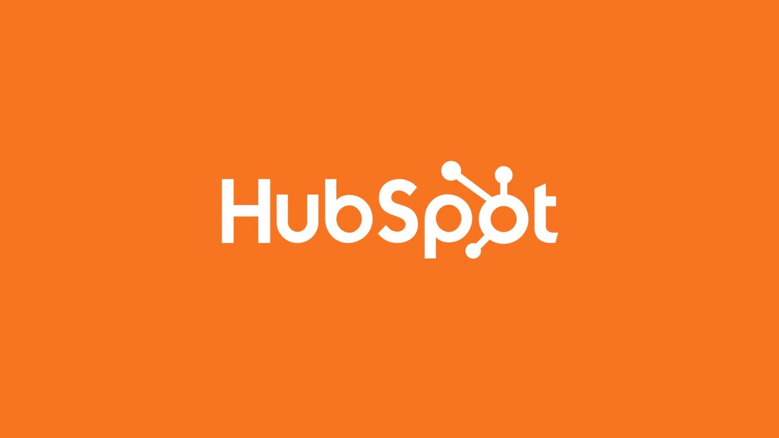
HubSpot is the all-in-one marketer who can do it all—social media, emails, lead tracking, analytics, and more. Their vibrant orange and clean blue interface gives a welcoming, friendly vibe that appeals to growing businesses looking to scale all areas of their marketing and sales efforts.
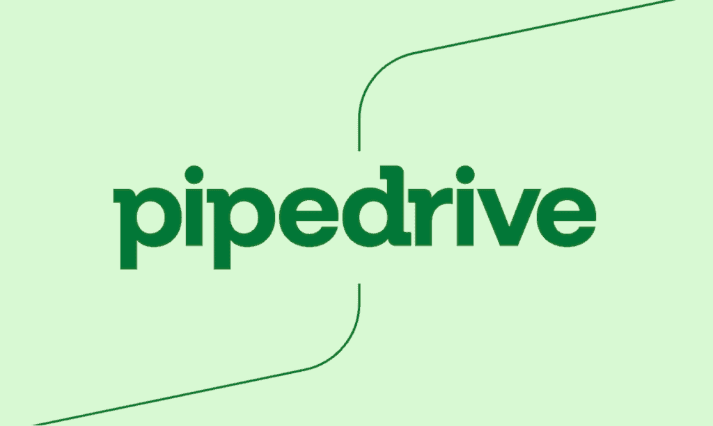
Pipedrive, on the other hand, is the salesperson who lives to close deals. It’s simple, streamlined, and laser-focused on sales. The green and black interface is designed for efficiency, and Pipedrive users love the no-nonsense approach to getting results fast.
Both tools are great for managing customers, but if you’re looking for a marketing machine, HubSpot is your choice. If closing deals is your main focus, Pipedrive fits the bill.
Xero vs. QuickBooks – The Nimble Accountant vs. The Household Name
When it comes to accounting software, Xero and QuickBooks are like two accountants with very different styles.
Xero is a nimble accountant who works from anywhere, anytime. Their cloud-first design uses calming blues and whites, reflecting their modern, flexible, and user-friendly nature. Xero is especially loved by small businesses and startups for its simplicity and ease of use.
QuickBooks, by contrast, is the veteran accountant who has been around forever and knows every trick in the book. Their brand, dominated by green and white, feels classic and reliable. They’ve built a reputation as the go-to for businesses of all sizes, offering deeper functionality for those who need it.
Both can balance your books, but Xero is your partner if you need something sleek and modern. If you want tradition and depth, QuickBooks is the way to go.
Conclusion: Every Brand Has a Personality
I use these pairings because they illustrate a principle I keep coming back to: product and design aren’t two separate things. The product is the promise. The design is the personality of the person making the promise. When the two align, the brand feels coherent — and coherent brands win.
When they don’t align, customers sense it immediately. A playful, colorful identity wrapped around a rigid, enterprise-minded product creates whiplash. A minimalist, premium aesthetic wrapped around a cheap, feature-bloated product breaks trust. Customers forgive a lot, but they don’t forgive feeling misled.
The exercise I recommend to every founder: pick five brands in your space and write, in one sentence each, what kind of person that brand would be at a dinner party. Then write the same sentence for your own brand. If you can’t finish the sentence — or if the sentence you write doesn’t match the personality your design is signaling — you’ve found the gap.
Personality isn’t decoration. It’s the fastest way a customer decides whether they’re in the right room.
Design your brand like you’d design a person: with intention, coherence, and the willingness to be specific about who it is — and who it isn’t.