Background
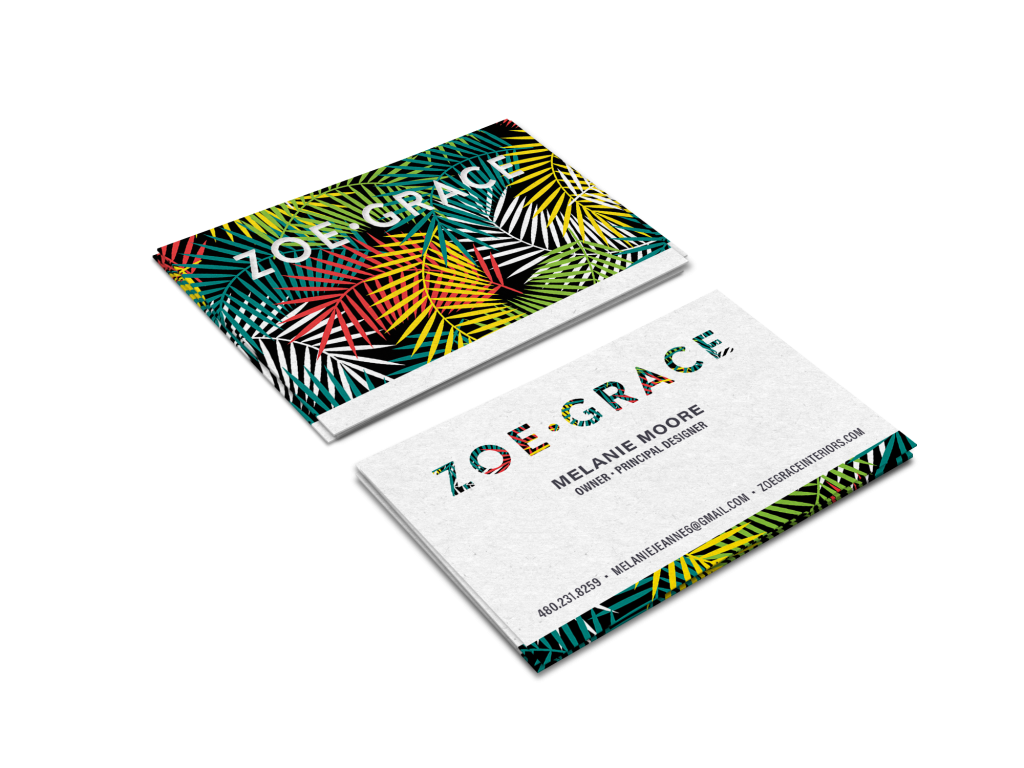
The client had a strong desire for the interior design brand to reflect her vibrant and lively personality. To achieve this, we proposed a simple yet bold word-mark that can serve as a versatile canvas for incorporating various textures and themes, allowing for endless possibilities in expressing her unique style.
In addition to the visually captivating word-mark, we designed a website with a clean and image-centric layout. This layout not only effectively communicates the client’s brand and services, but also ensures a user-friendly experience for both the visitors and the client herself. Furthermore, the website is equipped with a convenient backend system that enables easy updates and additions, giving the client full control over her online presence and ensuring that the website remains current and engaging.
Let’s create concepts with unique personalities.
The Final Design
The strong bold typeface allows the logo to hold a variety of textures, each expressing a unique personality.
There are numerous textures, vibrant and vivid colors, and a multitude of diverse backgrounds that can be discovered and seamlessly integrated into the word-mark container. This opens up a vast array of possibilities for creative expression and enhances the visual appeal of the design.


The business cards are a great example of the brands personality.
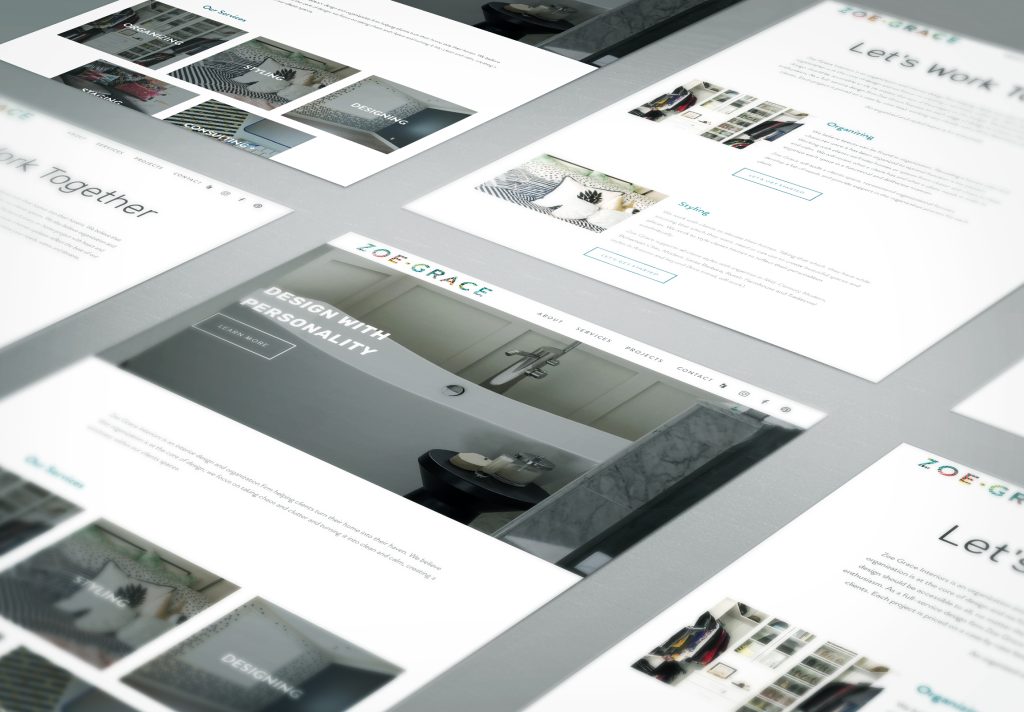
Website Design
The website design for Zoe Grace is a clean and visually centric portfolio that serves as a platform to showcase her impressive body of work. With a focus on simplicity and elegance, the design utilizes white space and a clean sans serif typeface to create a sense of minimalism and sophistication. The strategic use of vibrant colors throughout the website adds an element of excitement and liveliness, perfectly mirroring Zoe Grace’s vibrant and lively personality.
By incorporating ample white space, the design allows Zoe Grace’s work to take center stage, ensuring that the viewer’s attention is fully captivated by the stunning visuals. The clean sans serif typeface used for the text elements enhances readability and adds a touch of modernity to the overall aesthetic.
The website not only effectively communicates Zoe Grace’s brand and services, but also prioritizes user experience. The image-centric layout creates a visually engaging experience for visitors, while the convenient backend system enables easy updates and additions, ensuring that the website remains current and engaging.
Overall, the website design for Zoe Grace strikes the perfect balance between simplicity and vibrancy, allowing her portfolio of work to shine while reflecting her unique brand personality and visual identity.